How Momentum created a product 2-pager in 2 hours
FOUNDERS
COMPANY
Momentum—a sales platform for Slack that improves visibility and alignment between Sales and the rest of the organization.
TEMPLATES
Build a Box Messaging & Product 2-Pager Design Template in Figma to create a Product 2-Pager.
When Momentum got the chance to pitch to a big company, they knew they needed to not only ship a few features they’d been testing and nail the sales pitch—they also needed to produce a 2-pager that the prospect had asked for.
“To be honest, when our prospect asked for a “2-pager” I wasn’t 100% sure what it was. But I reached out in the Slack office hours and realized FMP already had a template for it. ”
What is a product 2-pager?
Product 2-pagers are a common marketing and sales asset and it’s exactly what it sounds like. It’s a two side PDF that distills your product benefits and features. A 2-pager saves time and provides clarity for the reader., but also for you! The act of creating this asset will force you to get real about what problem you’re solving and how you’re different.
Momentum just launched (October 2020) so things are moving fast and the product, positioning, and messaging has already been updated, but here’s a peek at their very first asset:
“Building this 2-pager was so smooth and took less than two hours since we already had our messaging done using the FMP sprints. Then the Figma design template lets us drop in copy and product shots.”
The product messaging
Momentum worked through the playbook to identify their brand story, personas, and Jobs to Be Done which laid the foundation for crafting their product positioning & messaging.
💡 You can get an introduction to the core components of product positioning and messaging along with a downloadable template in our free guide →
The design template
Figma is a web-based graphic design tool. Think of it like Google Docs for design. The playbook includes 20+ marketing & design templates like this one so you can drop in your text and images to produce clean, on-brand sales and marketing assets quickly. We’ve designed the templates to be easy for everyone—no design skills required!
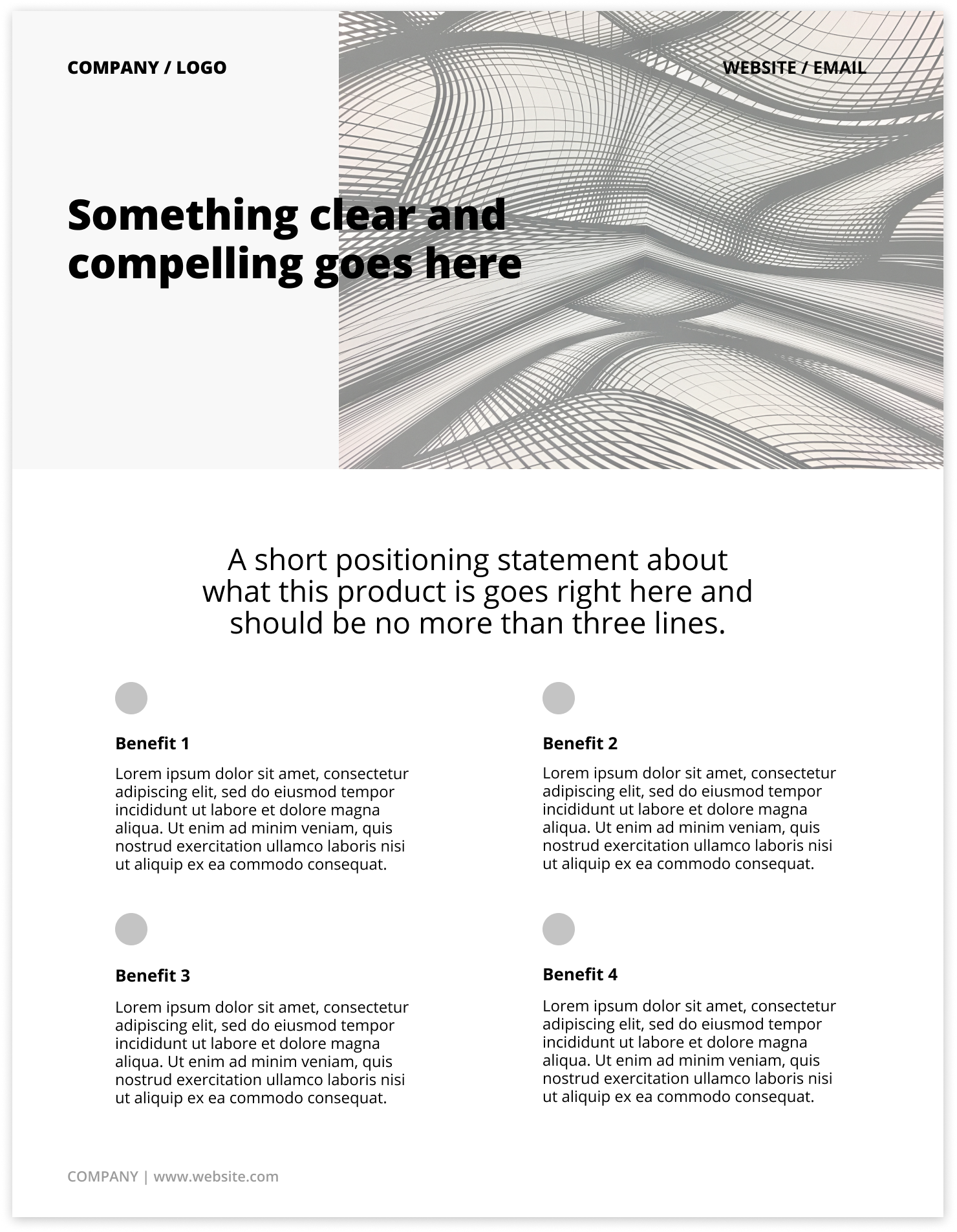
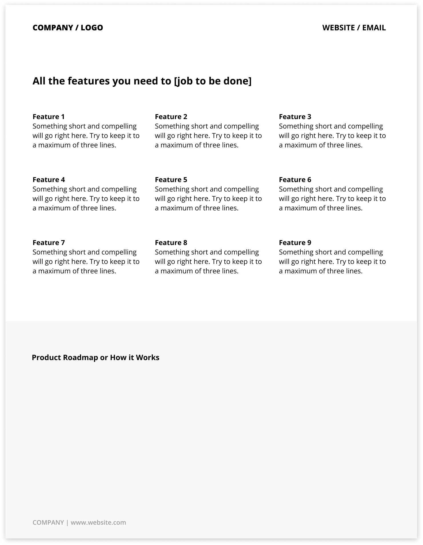
Here’s what the Product 2-Pager Template looks like:
“Being able to quickly create and iterate on marketing assets is critical to getting customers.”
The deliverable
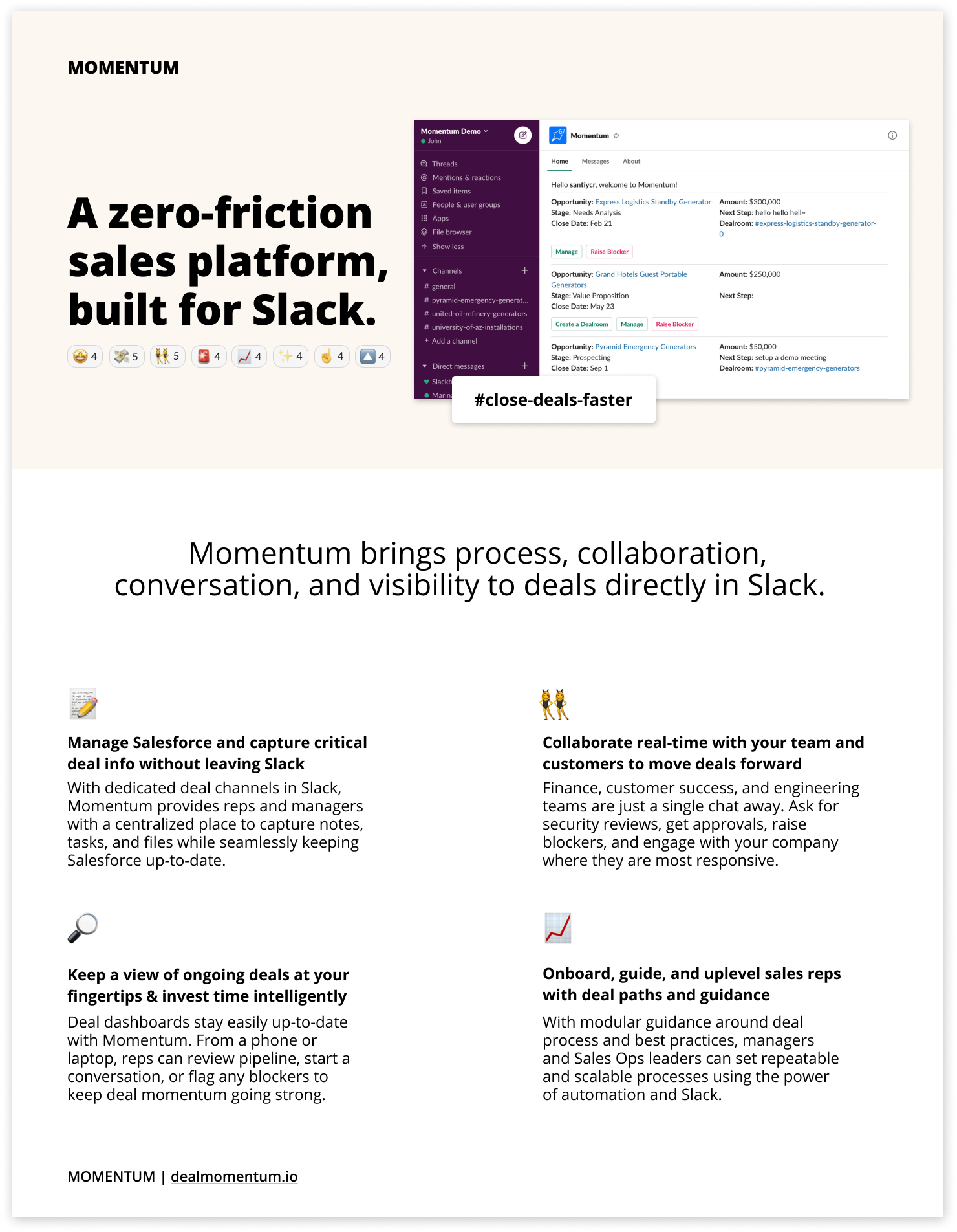
Once Momentum dropped in their product messaging and product screenshots, they decided to add some brand personality. Since they are a sales platform built for Slack, it seemed only right to have lots of emojis. 😜
They asked their friends in a Slack channel to react to a message so they could quickly grab a screenshot of the emojis and paste them under the headline. They also added a cheeky #close-deals-faster to communicate a core value prop and play on their deal rooms feature (a Slack channel for your Salesforce opportunity). And rather than bother using pre-made icons, they used Slack emojis to indicate the benefits.
The 2-pager is full of substance though, and the first page has a strong hero message, image, and subhead.
Front Page
Rather than focus on features on the first page, Momentum outlines the core benefits, speaking directly to their target personas—the AE and the sales team manager.
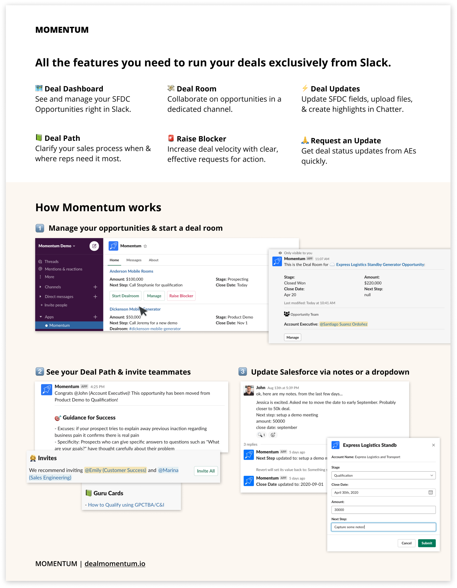
Back page
They kept the feature list small and focused the back page on showcasing how Momentum works. Existing product shots from their user guide were pasted in and they used the emojis 1️⃣2️⃣3️⃣ to indicate flow.
Now, when a prospect asks for something to share with their team, Momentum is ready. They’ve iterated a lot on features, brand, and messaging since then, but the template has been able to evolve with them. 🙏 Thanks to the Momentum team for letting us share an early marketing asset!
If you’d like to create fast, stunning sales and marketing assets with expert guidance tailored to your needs, contact us today to see how we can help bring your vision to life.


