The anatomy of an effective product landing page
11 Key principles that will help you capture your target audience’s attention, win their trust, and convert them to users.
1. Show your product
In this day and age, if you don’t show your product, people will assume it’s ugly or bad. Showing real screenshots (not vague, overly abstracted illustrations) of your product builds trust and gives prospective customers a glimpse of what they can expect by signing up.
Some examples of companies that do product mockups well:


Monday.com — nice mix of photography and product mockups
Rise — very clear on exactly how it works
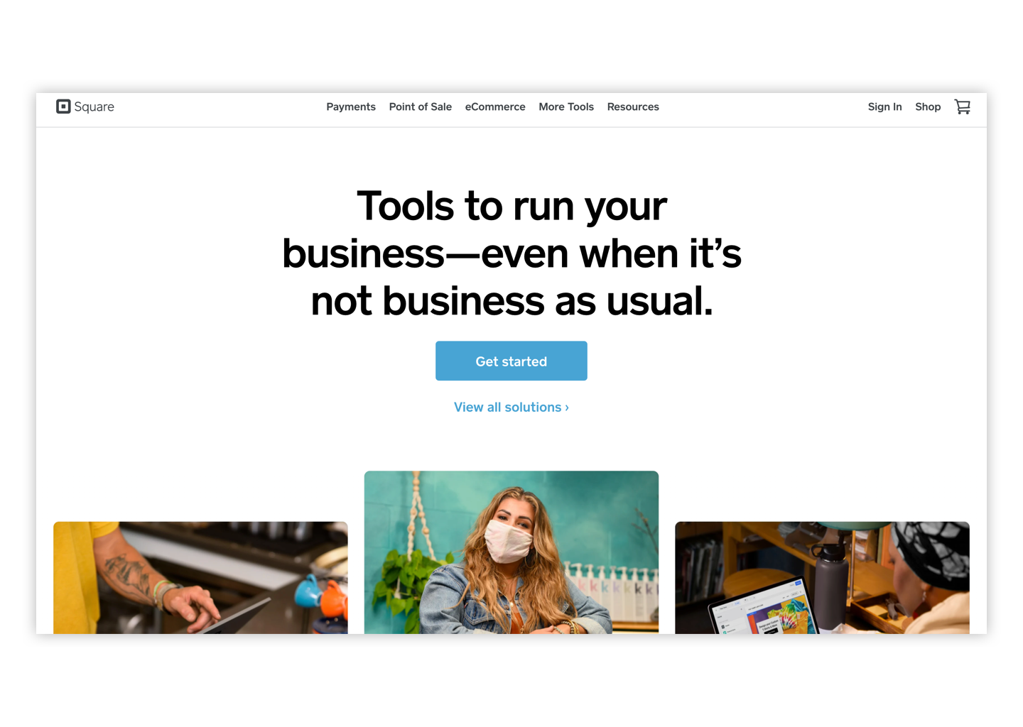
Square — stripped down but still useful
Stripe — fantastic job of showing complex product across physical credit card, mobile, and web apps
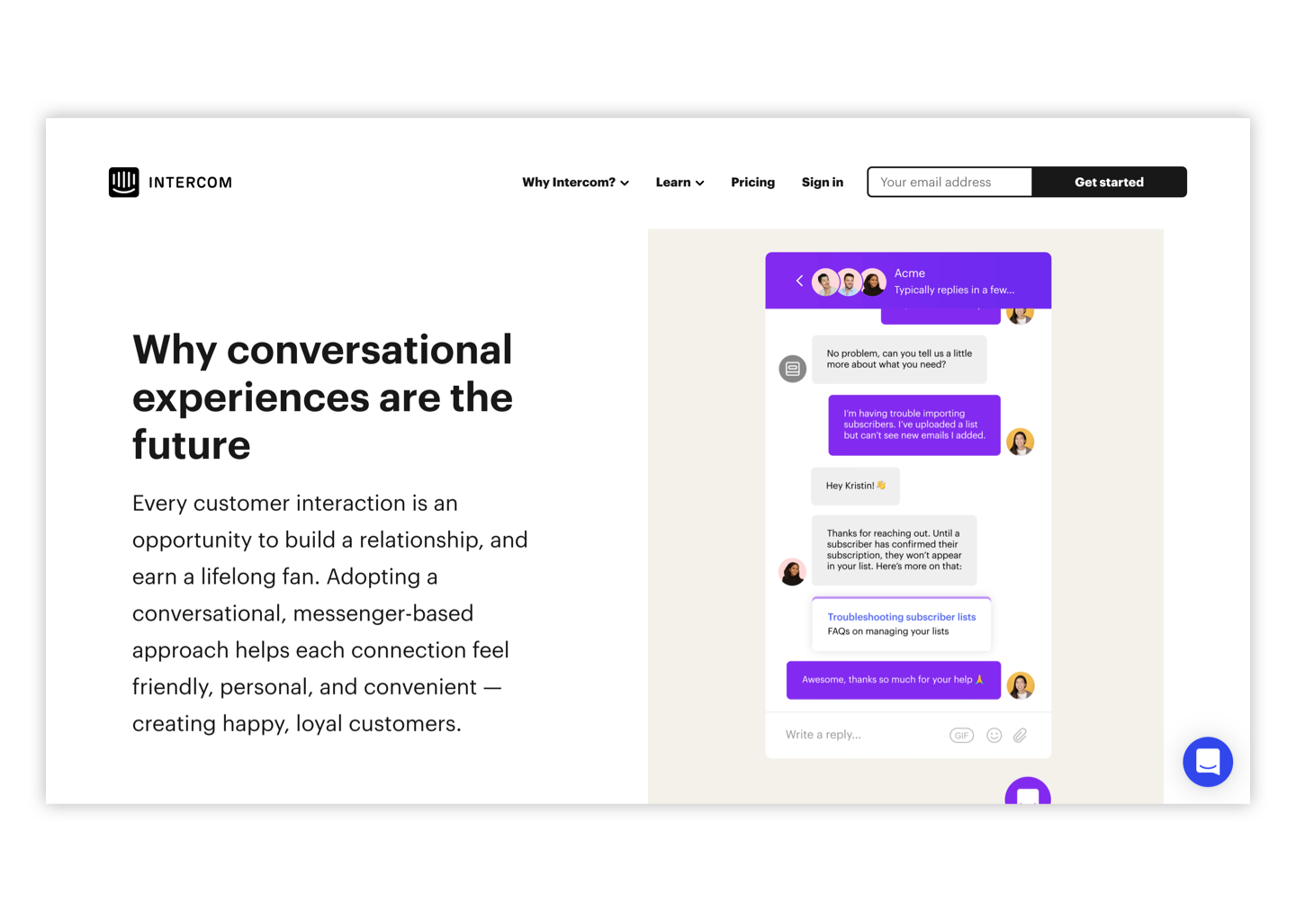
Intercom — clean, fun animations that support product copy
2. Give your page the right copy structure
Understand that users skim headlines before they read the body content (if they read body content at all). Write your copy accordingly so that your headlines read like a cohesive summary. In addition to having the right copy structure, you need to write actually great copy.
Great copy engages and compels and writing it is a skill that will serve you in almost everything you do—communicating with your team, composing cold outbound emails, creating sales decks and website pages. To learn some of the tricks of the trade, head over to one of our resources: Quick tips for writing great copy→
3. Provide a clear, consistent call to action
Unless you have a multi-product offering (and even if you do), you should choose a single clear call to action (CTA)—this should be based on the goal for your landing page. Once you’ve decided on your call to action, include it in a few strategic places throughout the page. Some effective places to include your CTA are in the hero, halfway down the page, and above the page footer. Make the CTA language as compelling as possible, so people know what to expect when they click on the button and are enticed to do so.
4. Show social proof
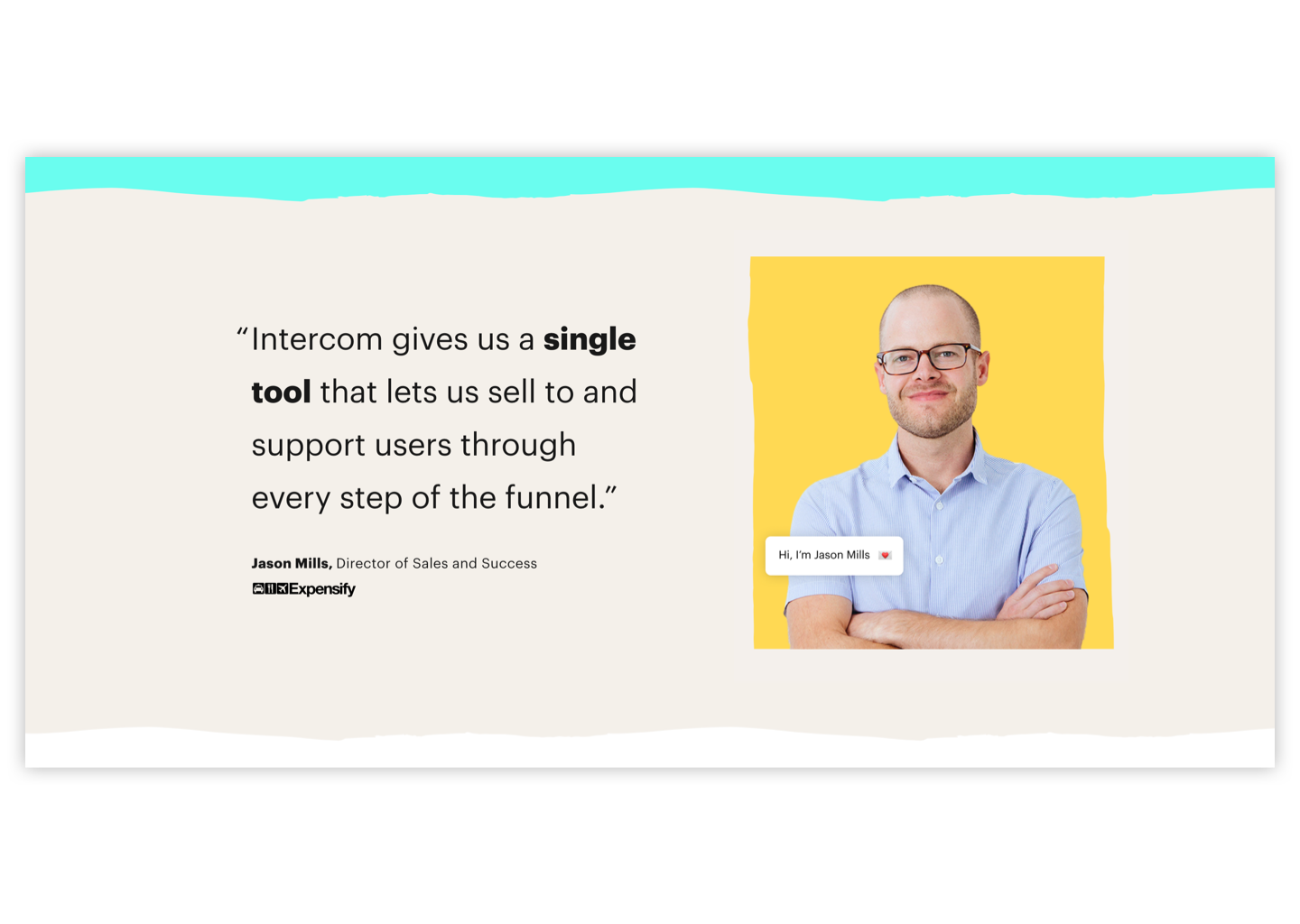
Showing how others are successfully using your product is an important element of convincing people to try your product. No problem if you don’t have thousands of customers and impressive logos. A simple statement that speaks directly to the product benefit of your target customer helps build trust and remove fear of the unknown. Whenever possible include a headshot—people are drawn to faces. Also, incorporate hard claims rather than fluffy statements. “I saved 50% by switching to Geico” is much stronger than “I really like Geico for my car insurance.”


5. Keep it short
If you only read one thing on this page, read this:
People do not read.
Only 50% of website visitors make it past the fold (the fold is the bottom of your screen when you land on a webpage but don’t scroll). Only 25% of website visitors make it half way down the page. So longer is absolutely not better.
You can use Inspectlet to see how far people are making it down the page and what they’re interacting with on your page.
6. Optimize your copy for your customer’s search terms (SEO)
Research what search terms people are using when they’re looking for a product like yours and incorporate that into your landing page copy. Google Trends is a helpful tool to help get you started.
7. Use tools to understand existing landing page behavior
Google Analytics: for tracking website visitor activity
Inspectlet: for understanding website visitor intentions
Examples of early stage, yet effective product landing pages for when features are light.
8. Use a sticky nav
Some designers don’t like sticky navs (when the top navigation bar is fixed on the page as you scroll) but they are proven to make for clearer navigation and conversions. Unless you are doing something very design-driven, I recommend keeping the nav fixed at the top.
9. Be real
We’re living in the age of advertisements. The average American is exposed to 4,000 to 10,000 ads every single day. As a result, people know when they are being marketed at and their brain has learned to tune it out as much as possible.
But authenticity cuts through the noise.
Olivine keepin’ it real
I opted for a screenshot from a real consulting session to include on the product landing page.
Patagonia’s authentic photos
Marketing Examples has an incredible list of examples proving that authenticity cuts through the noise.
Scripted vs. unscripted
Take a look at the first 30 seconds of these vision films. Both Asana and Envoy are great companies with similar missions to improve our experiences at work. But the Envoy Vision film is slightly more compelling because it’s not scripted. It was shot in a documentary style interview where the director asked open ended questions with the story in mind and then pieced the story together in post-production editing.
Asana’s Vision Film
Envoy’s Vision Film
Full disclosure, the Envoy Vision film was produced by Olivine.
10. Live chat
Live chat is proven to increase website conversions by a hefty amount. As for how much, it depends who you ask but many studies cite 30% increased conversions.
Live chat tools:
11. Exit intent pop up
Exit-intent popups are those things that show up just as you are about to leave the page. Yes I hate them and they feel icky, but they do work. Some studies show a 5%+ increase in conversions over regularly timed popups.
Email subscriber conversions
Again with an example from Marketing Examples, Harry Dry says exit intent popups convert the highest.


